1.

The State of the Internet - lovely visuals to demonstrate what's up with the internet, who's using it, how often, and how. Things learned from this:
(a) It's important to think about where data come from, since this visual repeatedly switches from a US to global data set
(b) The arrow for Netherlands should point to Netherlands, not Denmark. It really erodes your credibility
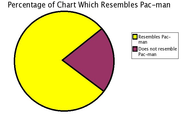
(c) Pick your visual carefully. People see pie charts and assume all things should go on one pie chart, forgetting that not all things are mutually exclusive
2.

We feel fine. - nice set of visuals from a several years' worth of phrase-mining on blogs. The project has sought any mention in blogs of "I feel" or "I'm feeling" phrases, aggregated them (at a rate of 15-20k per diem), and apparently--as a whole--the blogosphere feels fine.
3.

Annual Reports are Awesome. - a collection of stunning print items combining two of my favorite things to nerd out about--design and finance. I'm so glad OKgreat understands the lustful appreciation some of us have for both design and numbers.
4.

Design--nature trumps humanity. - Brainless slime molds manage to replicate the work of hundreds of engineers, nearly replicating the layout of the Tokyo rail system in a matter of hours.
5.

(apologies to
Colors of the Wind? - An LED array attached to mini wind turbines helps visualize wind patterns. Seems like it could be tremendously useful for plotting out wind farms or alternative wind capture devices.
6.

Physical Color Picker - the coolest concepts will never see the light of day. *sigh*
No comments:
Post a Comment